Tuesday, 14 December 2010
Magazine Advertisement for the CD/DVD Package Textual Analysis 2
 The album advertisement is advertising Green Day's album 'American Idiot'. This advertisement follows a convention that most other advertisements also use, which is the fact that the advertisment is simply the album cover but enlarged to fill the page. This ensures that the audience who sees this advertisement will instantly recognise the album in the shops or on the internet. This advertisement stands out as it has a plain black background with red and white font, and image, this gives the advertisement simplicity and also makes the image very clear. The font not only contrasts because of the colour change from the artist and the album name, but the artist is in all capitals whereas the album name is all in lower case. This advertisement is full of contrasts, even the picture is a juxtaposition. The fist squeezing a grenade in the shape of a heart, shows how the advertisement (and album cover, as the advertisement is the album cover, just enlarged) has been produced to provoke thought from its audience.
Magazine Advertisement for the CD/DVD Package Textual Analysis 1

This is a magazine advertisement for Basement Jaxx's album Rooty. This particular album advertisement is conventional of many other album advertisements because it enlarges the album cover. A reason for doing this would be the fact that the album will be easily recognisable by whoever has seen this advertisement.
The picture has obvious links with the album title 'Rooty' as it has a picture of a guerilla eating roots. This fairly normal picture is then combined with the background of space and also the bright flurescent colours which move up the left side of the advertisement, these colours also appear inside the font of the main text on the page which says 'Basement Jaxx'.
This album advertisement works well as it is very simplistic as it is of one image with a background, it combines a very natural style with a very futuristic and post modern font.
Monday, 13 December 2010
CD/DVD Package Cover Textual Analysis 3

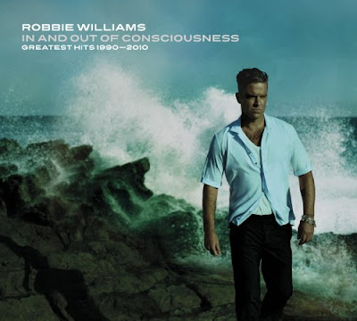
This is an album by Robbie Williams, it is his greatest hits album that was brought out recently in 2010. I have chosen to analyse this album against the other two I have chosen becuase it is a slightly different genre and is more mainstream, Robbie Williams appeals to a wider audience.
The colour base of this cover is light blue and whites fading through to black, the lighter colours at the top fading to the darker colours at the bottom, this is even represented by the colour clothes that Robbie Williams is wearing on the front cover. Another reason that this cover works so well is that Robbie Williams is a mainstream artist and a household name and therefore it seems an obvious advantage to have him on the front cover. The picture is of Robbie Williams walking along a rocky coast, and behind him it depicts the sea hitting the rocks behind him with him walking away from it. This one picture connotates Robbie Williams' life and links with the title of the album 'In and out of consciousness' as throughout his life he has had ups and downs, been involved with the break-up of Take That his previous band and has also had drugs problems, however he has had a brilliant solo career. This picture and album is meant to symbolise him walking away from all the bad things that have happened to him in the past and moving on.CD/DVD Package Cover Textual Analysis 2
 This is an album by 'The Libertines' and I have chosen to analyse this as they are the band that plays the song I have used to create my music video for. This album cover is a very distinct cover in the indie-rock genre. This is because 'The Libertines' are seen as one of the bands that really defined the indie-rock genre and therefore their albums get lots of attention.
This cover is a very simple one and is just a mid shot of Carl Barat and Pete Doherty the two most talked about and controversial members of the band. The cover depicts them showing the camera their famous 'libertine' tattoos, and they are also wearing the same beads around their necks, this shows they are united in one band. It could also have other connotations as in life away from the band Pete and Carl had fallen out many a time so this could show they are now commited to eachother and the band.
Pete and Carl are dressed in casual clothing and fit into the scruffy indie look that is conventional of bands of the same genre, the fact that they both have tattoos showing backs up this point aswell. This album cover also has a very unique font style, this font is very iconic and is an idea taken and improved from a 'Sex Pistols' album. The white font with black surrounding it really makes it stand out from the main picture.
CD/DVD Package Cover Textual Analysis 1
 This cover is for the 'Black holes and revelations' album by Muse. I have picked this album to analyse because it is a very distinct cover and Muse are a band with the same genre as the song I have chosen to recreate a music video for.
This cover is very conventional as it has a very obvious link with the title of the album. 'Black holes and revelations' automatically conjures up ideas of outer space and this album cover clearly depicts people on another planet, and if you look closer at the cover in the top left hand corner there is the earth roughly in the same position as the sun or moon would be. This therefore is meant to depict that they are in a black hole. The artist name and title of the album are also situated in the top right hand corner in bold black lettering, this on the light blue background makes them stand out. As soon as the audience looks at the album they know who its by and what its called, and they can pretty quickly work out the link between the picture and the album title. However some album covers tend to be more ambiguous and it is harder to work out who its by and what its called.
The shot is long shot so that the audience can see the people's full bodies and the table that they are sat around. It also allows the audience to see quite far back into the picture as it has lots of depth to it. This album cover plays on the idea of another world through a black hole, and it puts forward a few ideas.
Wednesday, 8 December 2010
Ancillary Texts
- a cover for its release as part of a digipak (CD/DVD package)
- a magazine advertisement for the digipak (CD/DVD package)
